Landing Page Optimization Explained Including Free Checklist

Landing page optimization or LPO is not an easy task.
That’s why we’re sharing our top tips to help you generate more leads and convert your prospects into customers.
What is Landing Page Optimization (LPO)?
Landing Page Optimization is the continuous process of improving a landing page’s conversion rate by conducting A/B testing. It requires you to use customer feedback, best practices, research, and trial and error.
The process of improving website conversion rates begins when you design your landing page and continues after the page is live.
As a web design and development agency, we recommend reviewing and optimizing your landing page on a regular basis.
Not sure how? Ask yourself the following questions in the LPO checklist below before you publish your next landing page.
Landing Page Optimization Checklist
1. Functional
- Does your landing page offer a seamless experience without any technical glitches?
- Do all of your hyperlinks redirect to a proper web page?
- Do your CTAs work?
- Are your images compressed to increase your page loading speed?
2. Accessible
Accessibility is essential as almost 80% of people say the most important element in website design is how easy it is to find information.
- Are you using headers, subheaders, bullet points, and concise copy to make your landing page scrollable, readable, and clutter-free?
- Is your landing page discoverable and accessible from different devices?
- Are you using alternative text for your images?
3. Useful
- Do you have facts and evidence to back up your information?
- Do you know your users’ goals?
- Does the content on your landing page help to answer those goals?
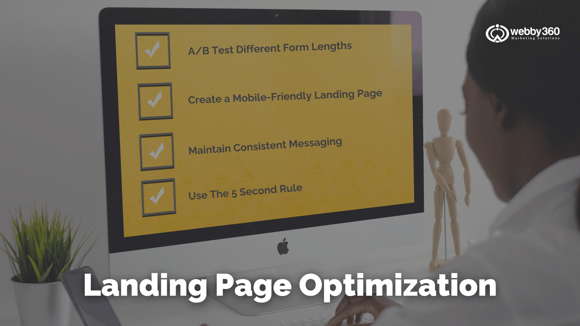
Try the 5-second rule. Ask a stranger to look at your landing page for a total of 5 seconds. See if they understand what your landing page is about.
4. Intuitive
- Does your landing page have one specific call to action?
- Is the navigation of your landing page easy to use?
- Are you providing a good website user experience?
5. Appealing
- Looking at the fonts, headers, and layout, is your web page design consistent?
- Does it follow your brand guidelines?
- Are you using whitespace to frame important information?
- Do you have relevant and high-quality images?
- Does your landing page have a simple design?
- Is there a good balance of bold and neutral colours?
- Is your title interesting and engaging?
Make sure you bookmark this article so you can use it next time you need to publish a landing page.
Using this landing page tool will help you to increase your conversions and revenue.
Landing Page Optimization Best Practices
Landing page conversion optimization is similar to designing a product. You might build hundreds of prototypes before you arrive at the final product.
Your landing page will also need a number of conversions. It should appeal to your audience, meet their expectations and influence them to act.
Now that you’ve gone through a high-level checklist to optimize your landing page, let’s go through Webby360’s top tips in more depth.
Top Six Tips for Optimizing Your Landing Page
1. Keep The Message Consistent Between Ads and Landing Pages
Many advertisers fail to notice the disconnect between what an ad promises and what the landing page delivers. Ensure the visual elements are consistent between your landing page and ads.
This offers a predictable experience for users and is a simple and quick way to double your B2B sales conversions. This also works well for B2C businesses.
2. A/B Test Different Form Lengths
The form on your landing page can make or break your conversion rate. The optimal length of the form depends on your needs. If you want more leads, keep the fields to a minimum, but if you’re looking for qualified leads, use more fields.
Use A/B testing, by creating two versions of the same landing page, to determine which of the two variants leads to maximum conversions.
3. Build A Mobile-Responsive and Mobile-Friendly Landing Page
Mobile devices account for almost half of global web traffic. But if you’re landing page is difficult to navigate on mobile devices, your bounce rate will skyrocket.
Make sure your web page is easy to use on a mobile device. This also means that forms should load quickly and be easy to complete.
If you make users’ experience on your landing page as seamless as possible, they are more likely to stay on your website and convert.
4. Craft Landing Page Copy with the Customer’s Voice
The copy and design of a landing page are equally important to the page’s success. Use the customer’s voice to create an engaging landing page.
Avoid buzzwords and jargon. Using vocabulary that your customers understand will lead to higher conversion rates. Showcase how your product or service benefits your customers.
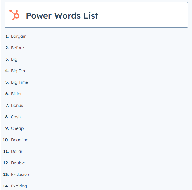
5. Use Power Words In Your Copy
Adding power words to your copy will take your landing page to the next level.
Use this list of 150 power words to create a compelling message that will enhance your landing page and appeal to your users’ emotions.

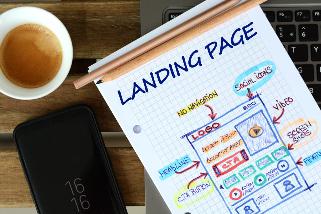
6. Add Video Content to Your Landing Page
In addition, it effectively builds relationships with potential customers and improves lead generation.
Videos can communicate a complex idea easier than text and reinforces your message and branding. Use video demonstrations and screenshots on your landing page to showcase your products and services.
Overall, optimizing your landing page is crucial to driving traffic to your website and increasing your conversions.
If you’re more of a visual learner, check out this infographic on how to build an effective and optimized landing page.
Continue reading if you want to review some of the basics including what a landing page is, 5 different types of landing pages you can create, and the 7 key elements of a landing page.
What Is A Landing Page?

A landing page is simply a webpage that directs users to your product, service or offer and encourages them to take a desired action.
In online marketing, it’s where users land when they visit your website, blog or homepage. It sits at the top of your inbound marketing funnel. Landing pages give you information about your audience and their preferences.
They bring in leads, increase conversions, improve the performance of your paid media ads and ultimately increase your return on investment.
You can use this information to make your overall marketing strategy more effective.
Five Types of Landing Pages:
1. Click-Through Landing Pages
This landing page provides the benefits and features of your product and service all in one page. It shows your users the value of your products and encourages them to try your services.
This leads them to click on the Call to Action (CTA) button fully educated about your product. Clicking on the CTA button takes them to another page with all your pricing details and payment information.
2. Lead Capture Landing Pages
Businesses use these landing pages to gather information about potential customers. That information could include their name, email address, job title, business name and industry, to name a few. The information gathered depends on your business needs.
A key tip: If your landing page is your top source of leads, don’t include a long questionnaire. Ask for more information once users show interest in your products.
The focus of a lead capture landing page is to create a pool of prospects for your sales team.
3. Paid Advertising Landing Pages
Businesses run paid ads on social media to general leads, but social media ads don’t always lead to sales.
It can take several interactions with a brand to convert leads into paying customers.
To get the best return on your investment (ROI), ensure your paid social media ads send users to the right landing page.
Consider using a lead capture landing page to collect information about your users.
4. Long-form Sales Landing Pages
Potential users have a lot of questions, and these landing pages answer all of them. Include frequently asked questions “FAQs” and the Five W’s — Who, What, When, Where, Why.
Also, answer questions regarding barriers and the benefits of your product. These landing pages are longer than other landing pages but be concise with your information.
Long-form landing pages are used at the bottom of the marketing funnel to persuade visitors to make sales.
5. Unsubscribe Landing Pages
This landing page is used for users to unsubscribe from your newsletter and email updates.
But you can use it to keep users by allowing subscribers to manage their preferences and reconsider their decision.
For example, users might prefer weekly instead of daily emails. You can also use images and diagrams to show your users what they will miss if they opt out of email communications.
The key to any landing page is to optimize your offer and gain sales. Choose your landing page based on where the user is in the buying funnel.
Now, it’s time to go through the Seven Key Elements Of A Landing Page.
What Should a Landing Page Include?
A landing page should include Headlines, Copy, Imagery, Call To Action (CTA), Social Proof, Contact Information, and Colour Contrast.
Let’s dive a little deeper.
Seven Key Elements of a Landing Page Framework
1. Headlines
Headings and subheadings help you build rapport with your users. They establish a connection with prospects. In today’s video and image-focused world, text still matters.
People read what you write, and it must be relevant to your audience. Consider your customer’s specific objective and turn it into a headline and subheading.
2. Copy
After reading the headline, visitors want more information about your offerings. Help your users understand your products with clear, concise, and to-the-point copy on your landing page.
Looking for some support with your website copy or blogs? Here are 5 reasons outsourced copywriting services is key to success.
3. Imagery
Remove any visual clutter from your landing page. A simplified landing page will direct users to your call to action.
4. Call to Action (CTA)
Your CTA directs your users to the next steps on your webpage. Increase your click-through rate and boost conversions with a compelling and impactful CTA.
Use action-packed words and create a sense of urgency with your CTA.
5. Social Proof
What is social proof? This concept says people will follow the actions of someone they trust. In today’s world, most users trust reviews.
Include testimonials, infographics, and reviews from influencers on your landing page. Include logos of companies and customers who engage with your brand.
Match your social proof to your users. If your landing page targets enterprise businesses, showcase testimonials from similar clients to establish credibility.
Create remote video testimonials to engage buyers and remove friction in the sales process.
Videos allow users to see a subject and understand the impact of purchasing the advertised product or service.
Leverage the benefits of digital reviews every time a customer shares a review. This increases brand awareness, recall and affinity, and encourages sales.
6. Contact information
Contact information on your landing page helps users send you questions about your products and service.
Include a live chat function, a phone number, an email address, or a contact form like this one.
For technology and Software-as-a-Service (SaaS) companies, include links to their help centers. Customers should find your contact information, frequently asked questions, and tutorials easily.
7. Colour contrast
Use colour contrast to help your CTA stand out. Consider playing the CTA against a textured, coloured background.
You can even add negative space between the CTA and other elements.
Final Remarks
Now that we’ve jogged your memory, you should know what a landing page is, the five types of landing pages, and the seven key elements of a landing page.
We’ve also reviewed what LPO is and how to use a checklist to optimize and monitor your landing pages.
Whether you’re looking to champion this task on your own or you’re seeking landing page optimization services, we hope you have a better understanding of what this process entails and how to execute it to get results.
Contact Webby360 Marketing Solutions today to discuss how we can optimize your landing page. Or, check out the small business digital marketing services we offer to help companies like yours grow.
At Webby360, we deliver the best results for your business.

